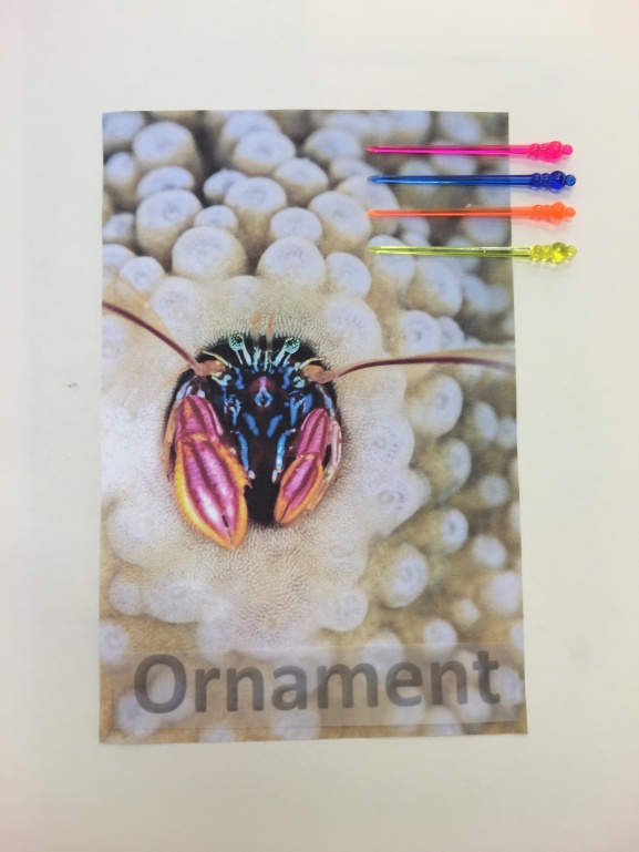
Further in to my research I have done more initial responses that are helping me deiced on what features of the coral I like and what I find interesting to continue in my design developments section but also it is helping me experiment with different colours and textures.
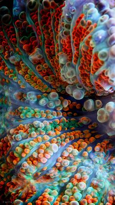
I wanted to try something different, instead of  creating 3D drawing or focusing on the texture I wanted to see how well I am at doing 2D detailed drawings, with that in mind I created a response of a close of up a coral creature using oil pastels I made sure I was very focused on the detail I wanted to show the shading where the light and dark is but also focus on the way the lines are to show the curves and how the object is not just flat but has dimension.
I really liked doing this drawing it did take a while to do but the end results where amazing, I do feel overall that I could have gone back into this drawing to add more shading this would have given it a more realistic feel to it. My aim is to continue doing detailed drawing as well as the more abstract as well, with more practice I can improve on my drawings and get them to a professional standard. I also think that I should also try doing a digital drawing maybe use the Wacom tablet this way I can say that I have widen my skills in the drawing section. Furthermore, I can take it a step forward and use Photoshop and change the colours show the different colours and use it as a colour pallet for when I am designing.
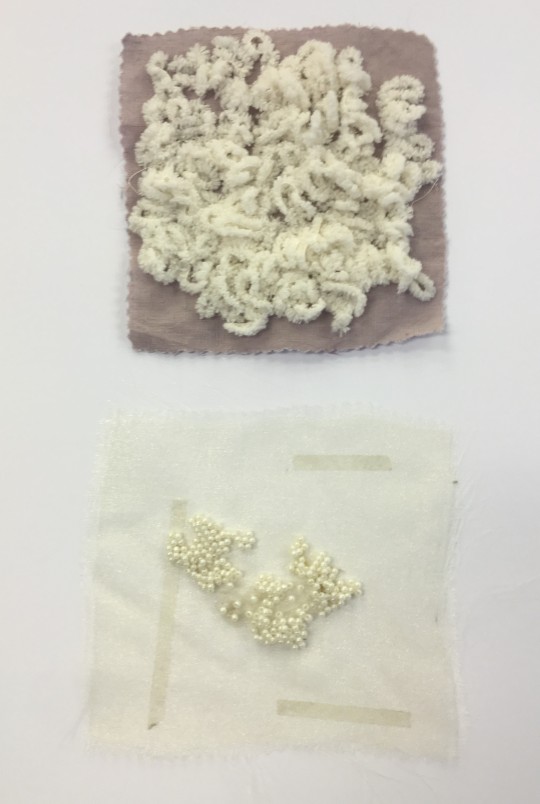
The next response I did is more of a mixed drawing it has a textile feel to it as-wel l as abstract I have carried the technique of the glue gun on this response but I have also added colour swatches to it the different shades of green. when I was looking at the images I collected, in my mind what struck me the most was how I could create the ruffles and creating these pom-poms it gave the affect I was aiming more I also created small finding that I also likes.
Overall I liked the affect I got but I think I could have improved on this page by creating more pom-poms and line them up together covering the page and giving it a fuller affect which have linked more strongly to the images I was referring to. If I had done that I might have been able to get an idea of it would have looked and maybe used it in my drawings also try with different colours to get an idea of how it would have looked in different colours.
Moreover, I continued with the detailed drawings and did a response of an octopus, 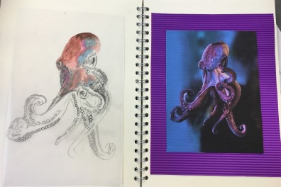 I really like this drawing as I have fully used colour I was trying to blend in the colours as much as I can see what comes out, what the colours will be like also to show the movement of the octopus. The reason for picking this image was because I was interested in the movements of octopus, how graceful they are plus I can use that quality in my work. Overall, I would like to have done more responses on this image as I do feel I could have Photoshop and used bold colours change the image add effects on the image to make it look more abstract this would have shown my digital skills.
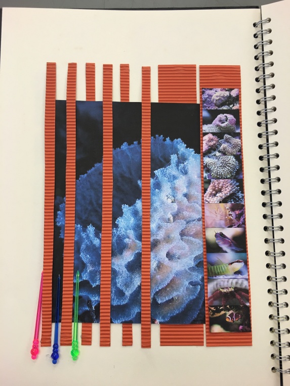
The final response I have in my initial sketchbook is an acrylic painting of coral rocks, I used the similar colours in the image but also focused on the shape of the rocks as I wanted to show the fine details as my aim is to replicate the surface texture into my designs and final garments.


![IMG_1128[1]](https://nosheenakhtarfmp.files.wordpress.com/2016/04/img_11281.jpg?w=201&h=268)