
When I was investigating different samples that I could create that could relate to my concept I came upon hand weaving also called tapestry weaving I looked in to this further to find ways I can create this sample, By watched this video of how to create your own tapestry however, in this video she uses a weaving frame I do not have one but I found an alternative video in that clip this lady uses a card board instead of a weaving frame she cuts out the each creating slits with 1/2 inch between each slit so the yarns are placed in them. I am interested in trying this technique out as it would be very exciting to see how this sample will come out and if it goes well I could use it in my final collection.
Further in to my research I have done more initial responses that are helping me deiced on what features of the coral I like and what I find interesting to continue in my design developments section but also it is helping me experiment with different colours and textures.
I wanted to try something different, instead of  creating 3D drawing or focusing on the texture I wanted to see how well I am at doing 2D detailed drawings, with that in mind I created a response of a close of up a coral creature using oil pastels I made sure I was very focused on the detail I wanted to show the shading where the light and dark is but also focus on the way the lines are to show the curves and how the object is not just flat but has dimension.
I really liked doing this drawing it did take a while to do but the end results where amazing, I do feel overall that I could have gone back into this drawing to add more shading this would have given it a more realistic feel to it. My aim is to continue doing detailed drawing as well as the more abstract as well, with more practice I can improve on my drawings and get them to a professional standard. I also think that I should also try doing a digital drawing maybe use the Wacom tablet this way I can say that I have widen my skills in the drawing section. Furthermore, I can take it a step forward and use Photoshop and change the colours show the different colours and use it as a colour pallet for when I am designing.
The next response I did is more of a mixed drawing it has a textile feel to it as-wel l as abstract I have carried the technique of the glue gun on this response but I have also added colour swatches to it the different shades of green. when I was looking at the images I collected, in my mind what struck me the most was how I could create the ruffles and creating these pom-poms it gave the affect I was aiming more I also created small finding that I also likes.
Overall I liked the affect I got but I think I could have improved on this page by creating more pom-poms and line them up together covering the page and giving it a fuller affect which have linked more strongly to the images I was referring to. If I had done that I might have been able to get an idea of it would have looked and maybe used it in my drawings also try with different colours to get an idea of how it would have looked in different colours.
Moreover, I continued with the detailed drawings and did a response of an octopus, 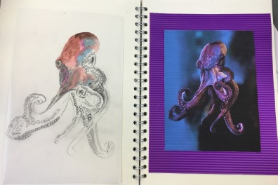 I really like this drawing as I have fully used colour I was trying to blend in the colours as much as I can see what comes out, what the colours will be like also to show the movement of the octopus. The reason for picking this image was because I was interested in the movements of octopus, how graceful they are plus I can use that quality in my work. Overall, I would like to have done more responses on this image as I do feel I could have Photoshop and used bold colours change the image add effects on the image to make it look more abstract this would have shown my digital skills.
The final response I have in my initial sketchbook is an acrylic painting of coral rocks, I used the similar colours in the image but also focused on the shape of the rocks as I wanted to show the fine details as my aim is to replicate the surface texture into my designs and final garments.

Continuing from the last two blog post of my progress of my initial sketchbook I have done more responses in my sketchbook that give me more ideas of what route I can take my FMP and what my overall concept board can be like.
While I was on Pinterest I fond images of coral like responses were the unknown person created using everyday objects found in the house with closer look you are able to see that they have used paper cupcake cases, with that in mind I wanted to try for myself and see what the outcome would be. It was a very fun process also it is very quick and easy to do that I would like to carry it out further maybe try different sizes also use other medium.


I do feel my strength lies within the more structural part of design I do like using different medium that I have not used before but it also gives me ideas of the shapes and patterns that I could crate in the making process how I can manipulate the fabric to link with the reposes I created in my sketchbook.
Furthermore, I also looked at jelly fishes as they are very eye-catching but more in the fashion thinking I found I came up with many ideas for design when looking at jelly fishes from there fluid movements to the shape of them that I could use in my designs. With that in mind I added them in my initial sketchbook. This way when I look back in the sketchbook I can get inspirational from all the coral sea life I researched about.


The next response I did was also a more 3D drawing it was with the thought of how it will feel, in this sketchbook most of my drawings are designed with the thought of how it will feel how I can apply these different mediums to create the different texture similar to the coral undersea. In this response I have used oil pastel first to get colour then I used the glue gun to create the bumps similar to the image I found on Pinterest which inspired me to create this response. I really liked that outcome I got when I applied the glue on top it looks like the glue is another colour also with the use of tissue paper and watercolours. I will continue with this technique in further experiments that I create as it I s very quick simple but I also believe that I can further develop this technique over time and maybe use it in my designs.


Yiqing Yin 2013 collection was known for a heath of fresh air with the embrace of experimentation and the amount of creativity gone into this collection. From looking at her collection in my opinion this designer as no constraints of symmetrical order or any traditional structure. When you examine Yins 2013 collection it is like you are looking at something magical something unrealistic that no one can imagine creating. It as if you have gazed at queens that you usually come from you wildest imagine seeing these strong willed women through your eyes as they march down the runway. Despite all the experimental components and structure there is still an eye for the finest attention to detail.


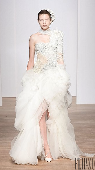

The colour pallet is very broad ranging from from translucent shades from nude to vibrant blues and reds. This link really well into my concept as Coral is very vibrant busting with colours but they are some corals that are very pastel, trying to get that into my initial sketchbook I want to show case the different colours that I can use in my designs. Looking at the garments silhouette she has made sure they are not constraint to the body, there is movement, fluidity of motion throughout the collection which enhances the details on the garments making them come alive as the gentle movement of the fabric as they move bring the details aloe as if they are replicating the movement of sea life. This will be very important part of my project, as I would like to get that freedom of movement into my collection. With the constant state of transformation and flow of fabric it enchanted that bodice figure contouring the models figure and giving the figure such a feminine touch with the fierce strong willed sense.

As I continue working on my sketchbook I have used the secondary images I found in Pinterest very inspirational which have helped me to get a better understanding of all the different type of responses I can create in my sketchbook to help show what key aspect of my concept I want to further develop. I had come across Alexander McQueen’s SS12 collection and the fins detail of the headsets was very inspirational as it linked to my concept of ornament/coral so to show that in my work I had did a detailed prorate of a women and using a glue gun I replicated the design of McQueen’s headset in SS12 collection. I wanted he portrait to show through the headpiece so I used tracing paper for the headpiece, by using the glue-gun I was able to create the impression of Lophelia pertusa the way it is fluid, fragile beauty to look at.


To improve on I would like to crate the web-like Lophelia pertusa using other media such as thread, I want to create the texture without using a paper to apply it on have it freely hanging on the image or garment this way I would be able to drape it the way I like, this could be done with the use of knit could be by doing lose knitting.

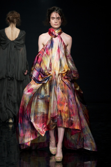
Yin Fall Winter 2013 collection is titled spring of Nüwa it is inspired by nature and its elements and Yin looked for inspiration from the Chinese legend of Nüwa the goddess that moulded the first men from clay. Her aim has been to crate a garment that product and reinforces but also make sure that the garments supple armour and second skin to the wearer. Yiqing Yin defines courtier as a ‘platform for creative freedom, expression, experimenting’ she has always kept her sculptural approach to her work so for her she sees the couture platform to give her enough space for her to express and push the limit of art emotion and story telling moreover, she she is able to have no boundaries of the materials she can use. 

Yiqing Yin Fall/Winter 12/13 collection she wanted to express the naive and pure side of nature through her sculpturing garments. Yin’s collection is about this idea of freshness and lightness. she’s was exploring the idea of birth the origin implicating the image if clay, water mixing together.


For this collection the designer focused mostly on the back of the garment, From watching the collection you are able to see what has been her main point of focus which is the areas between the shoulder blades she would enhance the features with the use of feathers or with knots of twisted silk running as a heavy rope from the nape of the neck to there lower back.
The final Piece of the collection was astonishing it was crinoline cage structure covered with feathers of pheasant peacock, goose, she had also added ostrich plums that have been burnt with the use of acid to give it the wet effect.

‘full of paradox, complex, strong willed, a women with a very sensual side, but a very masculine one’ yin says about the way she sees the Yinqing Yin women as. she has stated that she doesn’t design for herself but she does use her own attitude in the designing section. More-so she is not afraid to assert her singularity to be different and to communicate something about her identity through her wardrobe and appearance.
My day was spent in the blue reef aquarium. It was a day where I collect primary images for my project by going and see what the sea life is like I was able to get great shots of the way the coal behave also know the range of coral there are in the sea life even though they did not have much I was still able to see what small collection and it was very intresting to see first hand how they move with grace within water. I also able to see the sea life, the different fishes from clown fishes to lion fishes it was fasctinign to see them swim around how they move so fluidly full of grace which sinpired me to think of how I would like imply they gracefulness into my design and final collection.
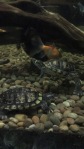


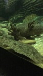
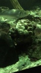


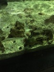


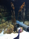


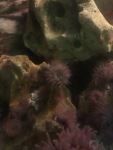


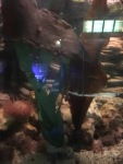
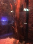

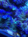


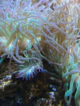


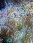

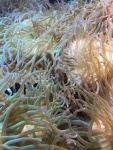
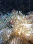
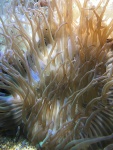
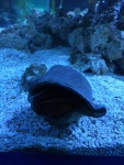


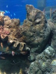


By vising the blue Reef I was able to take many images and clips I enjoyed watching the sea life as I will have enough knowledge and images to work with to create strong responses that will help inspire me when I am designing.
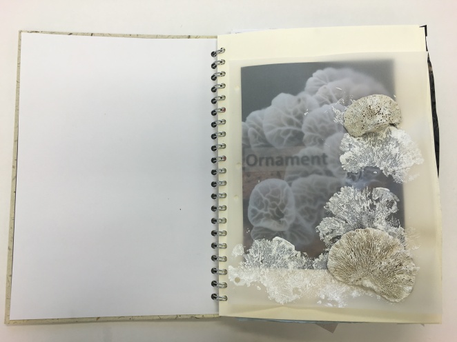
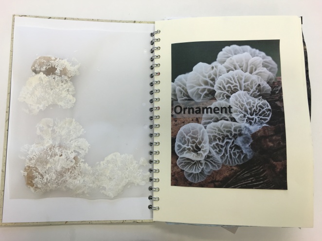
To start of my reposes I have decided to use a A4 sketchbook to carry out my initial design ideas. It was very important for me to get the first page right I wanted to make sure that when the viewer open to the first page they are able to know what my concept is about or what I have been inspored by. With my concept being Coral I have decided to name my concept ‘Ornament’ I found it very fitting name for my project as it described the purpose of concept, coral is a very beautifully place to see it makes the sea life more attractive to look at and that is why I have decided to name my project Ornament as I will apply coral in to my design to make my collection attractive and eye-catching. The purpose of coral in my collection is to be admired by everyones eyes, to be appreciated by its silent beauty.
I have crated prints with the use of shells that I had found I wanted to replicate the deisgns of the Brain coral it has a very fasintating patern that I would like to take furher in to my design section. I will be doing more intail resposes with the pattern of the Brain Coral. I would like to try other methods to recreate the marks from the Brian Coral. When I created these prints I was hoping to get a 3D print similar to the inspirational image I have applied on the page but the prints came out more 2 dimension which didn’t give the surface affect I was aiming for, the alternative route for me would be to try printing with another media for instant try with clay or play dough this way I can try different patterens and see which one has worked the best.